고정 헤더 영역
상세 컨텐츠
본문
People who use Spotify aren’t always happy with their experience. Sometimes things are not working, not clear, or not built to address a wide-enough variety of needs. That’s why our Support team exists — to make sure people can get the help they need, when they need it.
스포티파이를 쓰는 사람들은 항상 좋은 경험만 하는 것은 아니다. 가끔은 작동이 안되거나, 깔끔하지 않거나 다양한 니즈들을 충분히 만족시키지 못하기도 한다. 고객지원팀이 존재하는 이유가 여기에 있다. 그들이 필요할때 도움을 충분히 받을 수 있도록 하기 위해서.
These help moments are critical. A bad help moment makes a frustrating experience even worse, while getting the help moment right can build lasting trust between a company and a human. You won’t be surprised that we’re always striving for the latter :-)
도움의 순간들은 중요합니다. 좋지 않은 도움의 순간들은 짜증나는 경험을 더 나쁘게 만들 수 있지만 올바른 도움의 순간은 유저와 회사간의 신뢰를 지속시켜 줍니다. 우리는 항상 후자를 위해 노력하고 있다는 사실에 놀라지 않았으면 합니다.
Oh and allow us to introduce ourselves! We’re a design and research duo from the CSAT team (it stands for “Customer Support Systems And Technology”). We work on the support experience at Spotify — specifically the resources that help users help themselves. Beyond traditional product and brand design, we've got a whole bunch of services at Spotify that need design magic. And it’s our job to ensure that our service truly serves the needs of the people!
우리 소개를 할게요! 우리는 CSAT팀에 디자인과 리서치 듀오입니다. 스포티파이의 고객지원을 위해 일하고 있습니다. 특히 사용자 스스로 해결하는데 도움을 주고 있습니다. 전통적인 프로덕트나 브랜드 디자인을 넘어서, 디자인 매직이 필요한 모든 스포티파이의 전체 서비스에 도움을 주고 있습니다. 또한 우리는 사람들의 요구에 진정성있게 부응하도록 보장하는 것이 우리의 일이기도 합니다.
So how do we strive to get the help moments right? In lots of little ways, of course, but moreover by starting to follow some foundational principles that we feel are particularly suited to designing for our Support experience. We came up with these principles over the past few months by 1) talking with users to understand their needs, and 2) adopting familiar design patterns that we’ve seen work well at Spotify.
그러면 우리는 도움이 필요한 순간 어떻게 노력하고 있을까? 물론 작은 여러가지 방법이 있지만 고객지원 경험을 디자인하는데 특히 적절하다고 느끼는 몇가지 기본적인 원칙들을 따르기 시작했습니다. 우리는 이러한 원칙들을 지난 몇달동안 발견했는데 1) 사용자들의 니즈를 이해하기 위해 대화하고 2) 스포티파이에서 효과가 있어왔던 친숙한 디자인 패턴들을 적용하는 것이다.
Below, we explain each principle and illustrate how it applies to an experience on our Support site. There’s also a handy checklist that shows how we evaluate whether we’re delivering on the principle. You’ll notice that not every illustration ticks every box on its corresponding checklist, but that’s okay! They’re meant to be a reminder of our goals, and every checklist item may not apply in all situations.
아래에서 우리는 각각의 원칙을 설명하고 우리의 고객지원 사이트에 어떻게 경험이 적용되고 있는지 보여준다. 또한 간편한 체크리스트가 있는데 그것은 원칙에 맞게 전달하고 있는지 아닌지를 어떻게 평가하고 있는지 보여준다. 모든 그림에서 체크리스트 박스가 체크되어 있지 않다는 것을 알게될 것이다. 하지만 괜찮다! 그것은 우리의 목표를 리마인드하는데 의미가 있으며 모든 체크리스트가 모든 상황에 적용될 순 없다.
Note that these principles are newly established, so in time they’ll shape how we think about the Support site. That means the illustrations you see below don’t reflect what’s on the Support site now. Rather they’re a peek into our personal crystal ball and a glimpse of what’s to come.
Ok, enough principle preambling — here are the principles themselves!
이 원칙들은 새롭게 정립되어 곧 우리가 고객지원 사이트에 대한 우리의 생각이 모양을 갖출 것이다. 이 뜻은, 아래에서 보게되는 그림들이 현재 고객지원 사이트에 반영되지 않은 그림이라는 것을 의미한다. 오히려 그들은 앞으로의 변화와 우리의 청산지을 살짝 엿보는 것입니다.
좋아요. 서두는 여기까지하고 여기에 이제 원칙들을 소개할게요!
Principle 1: Transparent
Offer users visible and direct access to help, with transparent communication in both human and automated channels.
What users say:
“Tell me why the issue was caused in the first place. And just tell me what you did when you went away for ages. Not just ‘I have sorted it.’”
Checklist for transparent:
- We’ve informed the user of what’s happening and why.
- We’ve provided evidence and communicated progress.
- We’ve provided access to help in a way that is visible and direct.
원칙1. 투명함
자동화된 채널과 사람 모두에게 투명한 커뮤니케이션으로 유저들이 가시적이고 직접적으로 도움에 접근하도록 합니다.
사용자 의견:
"왜 첫페이지에서 문제가 일어났는지 이유를 말해줘. 그리고 그냥 니가 자리를 비웠을때 뭘 했는지 그냥 말해줘. 단순히 "정리를 완료했습니다." 가 아니라."
원칠1. 점검표:
- 무슨일이 있어나고 있는지 그 이유를 유저에게 알렸습니다.
- 증거를 제공하고 진행사항을 전달했습니다.
- 우리는 가시적이고 직접적인 방식으로 도움을 받을 수 있는 권한을 제공했습니다.

Principle 2: Empathetic
Listen to our users, trust what they say, and make them feel valued in a polite and personalized way.
What users say:
“The worst is when it's a different support advisor every time I have to go through everything AGAIN. I already spoke to 3 different people. Surely, I mean surely, they have notes from my case?!”
Checklist for empathetic:
- We haven’t wasted the user’s time, and all steps in the experience add value.
- We’ve used what we know about the user to simplify their experience.
- We’ve listened to the user and responded in an intelligent and relevant way.
원칙2. 공감
사용자에게 귀기울이고, 그들의 말을 신뢰하며 개인화되고 공손한 방식으로 그들에게 가치가 있음을 느끼게 하라.
사용자 의견:
"매번 내가 겪었던 일에 대해 반복해서 다른 상담사들에게 말해야할 때 최악이었어요. 이미 3명의 사람들에게 말했다구요. 확실해요. 그들은 제 상황에 대해 메모도 하지 않나봐요?!"
원칙2 점검표:
- 우리는 사용자의 시간을 낭비하지 않았고 경험하는 모든 단계에 가치를 더한다.
- 사용자들의 경험을 단순화하기 위해서 사용자에 관해 알고있는 것을 사용하곤 했습니다.
- 사용자의 목소리에 귀기울이고 현명하고 적절한 방법으로 응답했습니다.

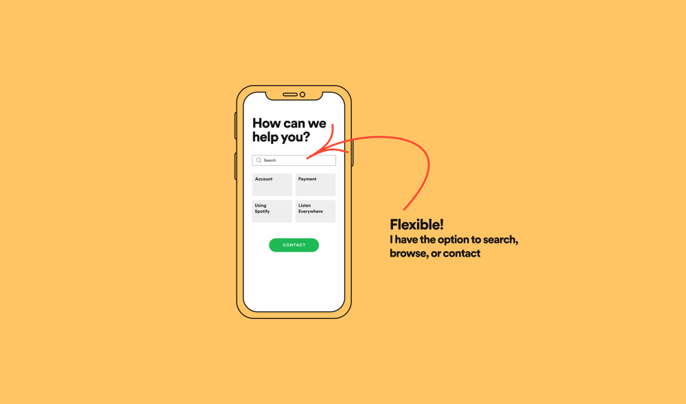
Principle 3: Flexible
Give the user the power to approach their help situation based on their preferences in the moment, which are dependent on the issue and environment.
What users say:
“I wouldn't call tech support or customer service while I'm on the go, like while I'm on the subway train... In that case I would use an app or chat instead. But I'm not sure I would actually solve a problem like this when I'm on the go, unless it's extremely urgent.”
Checklist for flexible
- We’ve adapted to the user’s help situation and offered options to access help (search, browse, or contact).
- We’ve empowered users to self-help for issues where self-help is possible.
- We’ve provided direct contact options for issues where advised support is required.
원칙3. 유연함
상황에 따라 사용자들의 선호도에 맞추어 해결방법에 접근할 수 있도록 해라, 그리고 그 상황은 문제와 환경에 달려있다.
사용자 의견:
"지하철을 타고 있는 경우 처럼 외출중일때는 기술 지원자나 고객서비스에 전화하지 않을 거예요. 대신에 이런 경우 앱이나 채팅을 사용하곤 해요. 그러나 급박한 상황이 아니라면, 외출중일때 이런 방식으로 진짜 문제를 해결할 수 있는지는 확신하지 못하겠어요"
원칙3 점검표:
- 우리는 사용자가 도움이 필요한 상황을 받아들이고 해결할 수 있는 방식의 옵션을 제공했다 (검색, 탐색 또는 연결)
- 우리는 사용자가 직접 해결이 가능한 경우라면 스스로 해결할 수 있도록 도와주었다.
- 전문가의 도움이 필요한 문제에 대해서는 바로 연결할 수 있도록 옵션을 제공해 주었다.
So those are the principles! Beyond referring to them during the design process, we use them as a common language, so everyone on our team can participate in conversations about our users’ needs. The principles are a lens we all look through to see what our users see, enabling us to agree on what we want to achieve.
In many cases, what users want is for us to immediately fix, clarify, or redesign the thing that brought them to our Support site in the first case. We can’t always do that, but our principles enable us to react in a way that is, well, principled. We can acknowledge our users’ feelings. We can provide not just one path, but an experience that adapts. And we can behave at every turn in a manner that is respectful, caring, and human.
뭐 이런 원칙들이 있다! 디자인 작업동안 참고하는 것을 넘어, 우리는 공통 언어로써 사용하고 있어 우리 팀의 누구나 사용자의 니즈에 대해 이야기할때 참여할 수 있다. 원칙들은 우리 사용자가 보는것을 모두 보게 해주는 렌즈이며, 우리가 무엇을 성취하고 싶은지 동의할 수 있게 해준다.
대부분의 경우 사용자가 원하는 것은 가장 먼저 고객센터 사이트에서 가져온것을 즉시 수정, 명확화 또는 리디자인하는 것입니다. 우리가 항상 그렇게 할 수 있는 것은 아니지만, 우리의 원칙들은 우리가 원칙적인 방식으로 반응할 수 있도록 해준다. 우리는 사용자의 감정을 이해할 수 있다. 하나의 방식만 제공하는 것이 아니라, 경험에 맞춘 방식을 제공할 수 있다. 또한 존중하며, 조심스러우며 인간적인 매너로 항상 응대할 수 있다
-
프로덕트 디자인을 하다보면 메인 핵심기능에 초점을 두어 고객센터와 CS관련된 부분을 놓치기 쉽다. 사실 사용자의 불편함을 가장 가까이에서 바라보고 즉각적인 해결이 필요한 순간이기 때문에 사용자 경험에 있어 무엇보다 중요한 순간이다. 따라서 어떤 CS들이 많이 들어오며, 운영 리소스를 줄이면서 앱 프로덕트 자체에서 불편함을 바로 해결 할 수 있는 방법은 무엇이 있을까와 같은 CX관점의 고민도 디자이너에게 중요한 부분이라는 생각이 든다.
스포티파이는 실제 유저들의 CS를 해결하기 위해 그들만의 원칙을 정하고 세부적인 체크리스트를 만들어 해당 원칙을 프로덕트에 녹여내고 있다. 디자인 에셋이나 스타일 가이드가 앱의 통일성있는 UI를 제공한다면 이러한 디자인 원칙은 일관성 있는 UX를 제공한다. 특히 디자인 팀이 있는경우 이러한 원칙을 정해두는 것이 일하는 방식에 있어 효과적이다. 공통의 디자인 언어가 생길 때 각자 다른 페이지를 만지더라도 사용자에게 통일된 서비스 경험을 제공할 수 있으며 디자인 의사결정에 있어 좀 더 효율적으로 일할 수 있기 때문이다. CX와 관련된 디자인 원칙을 세우기 위해서는 실제로 유저가 앱을 사용하다 짜증나거나 답답하거나 당황스러운 순간은 어떤 때 인지 인터뷰나 리서치를 통해 모아볼 수 있을 것이며 좀 더 큰 프로덕트 관점의 디자인 원칙을 세우기 위해서는 내부관계자들끼리 사용자에게 어떤 가치를 주고 싶은지에 대해 다 함께 이야기 해볼 수 있을 것이다. 이후 나온 의견들을 어피니티다이어그램을 통해 다시한번 정리 해 각각의 프로덕트에 맞는 디자인 원칙을 도출해 보는 것도 재밌을 것 같다는 생각이 든다....!
원글: https://spotify.design/article/happy-to-help-how-we-design-for-customer-support
'읽기' 카테고리의 다른 글
| LOGICAL THINKING (1/3) (0) | 2022.11.27 |
|---|---|
| Ask Spotify Design 06 (0) | 2022.11.05 |
| Beyond "Good Job": How to Give Impactful Feedback (0) | 2022.10.02 |
| UX lessons from Big Sur (0) | 2020.12.13 |
| Design Better Forms : Common mistakes designers make and how to fix them (0) | 2020.11.17 |


댓글 영역